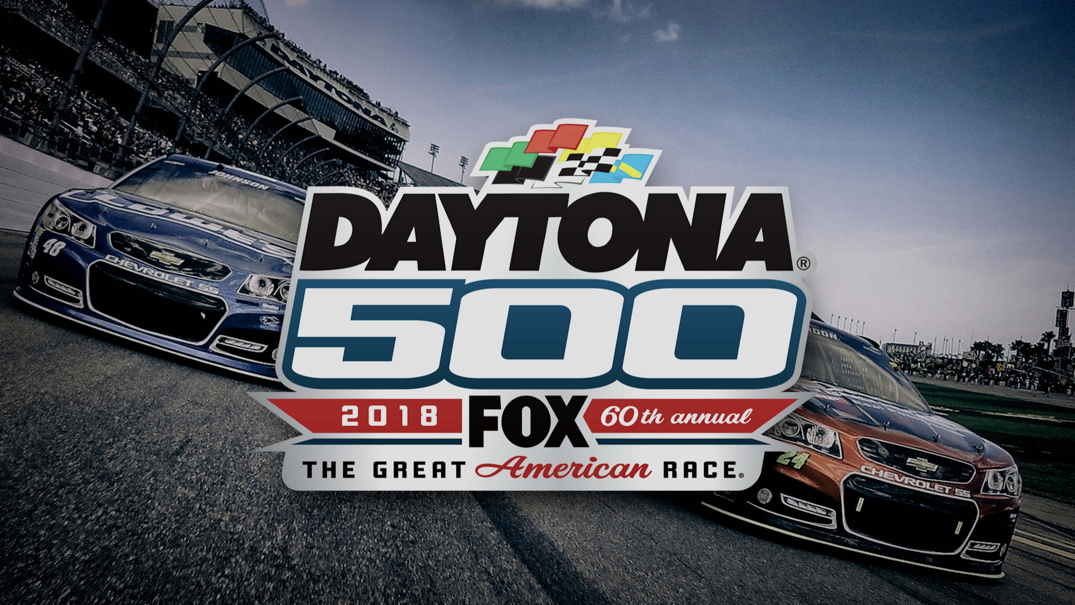
Daytona International Speedway isn't just a racetrack — it's an American institution. As lead designer for the track, the job was to honor 60 years of history while pushing the brand into a new era. A $400 million stadium renovation had transformed the facility; the visual identity needed to match.
The work spanned every platform and format: social media graphics, email campaigns, large-format print, event brochures, photo composites, vehicle wraps, billboards, tickets, and credential passes — all produced under strict sponsorship guidelines and race-week deadlines where there's no second chance.
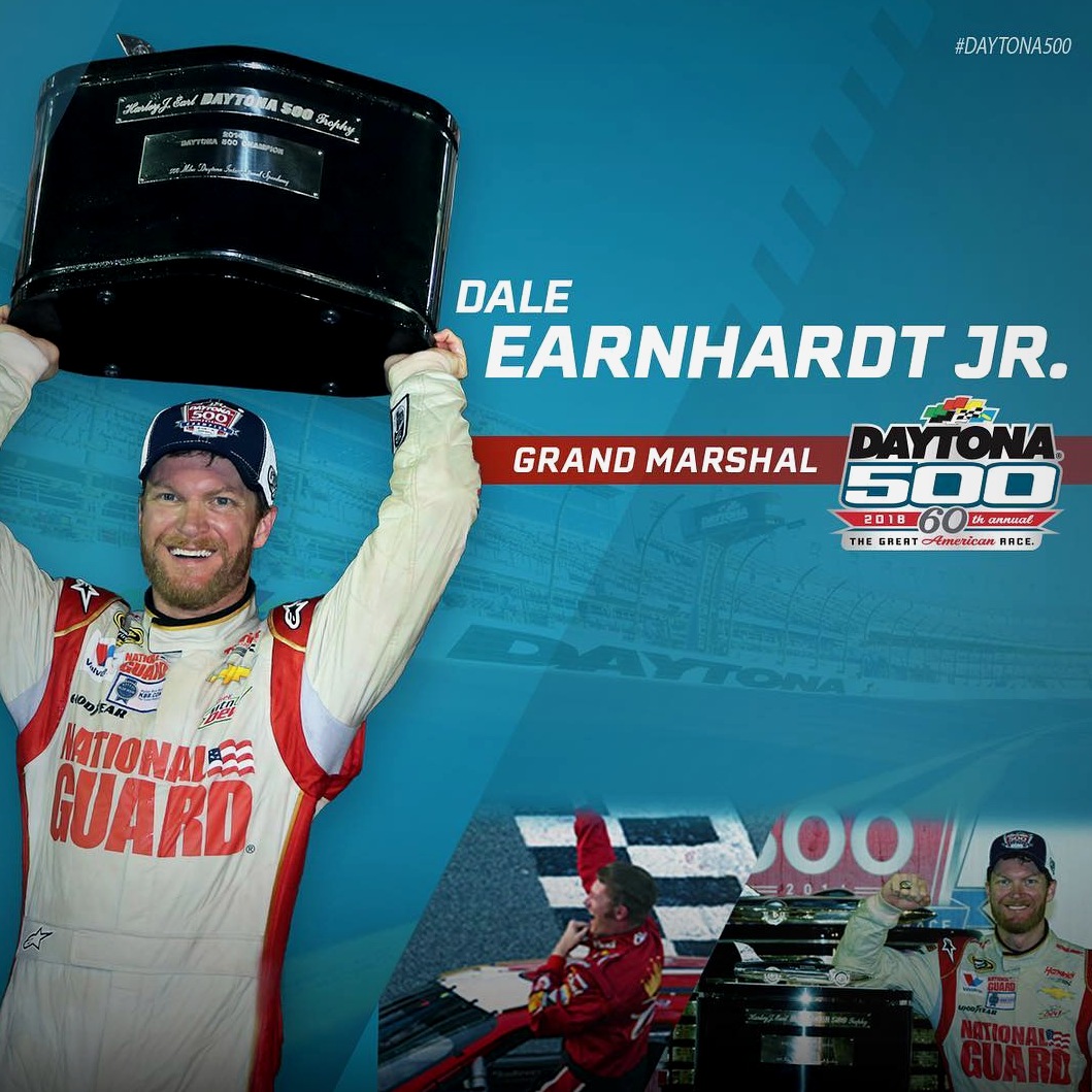
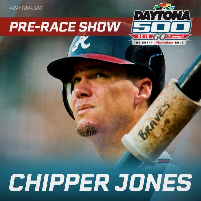
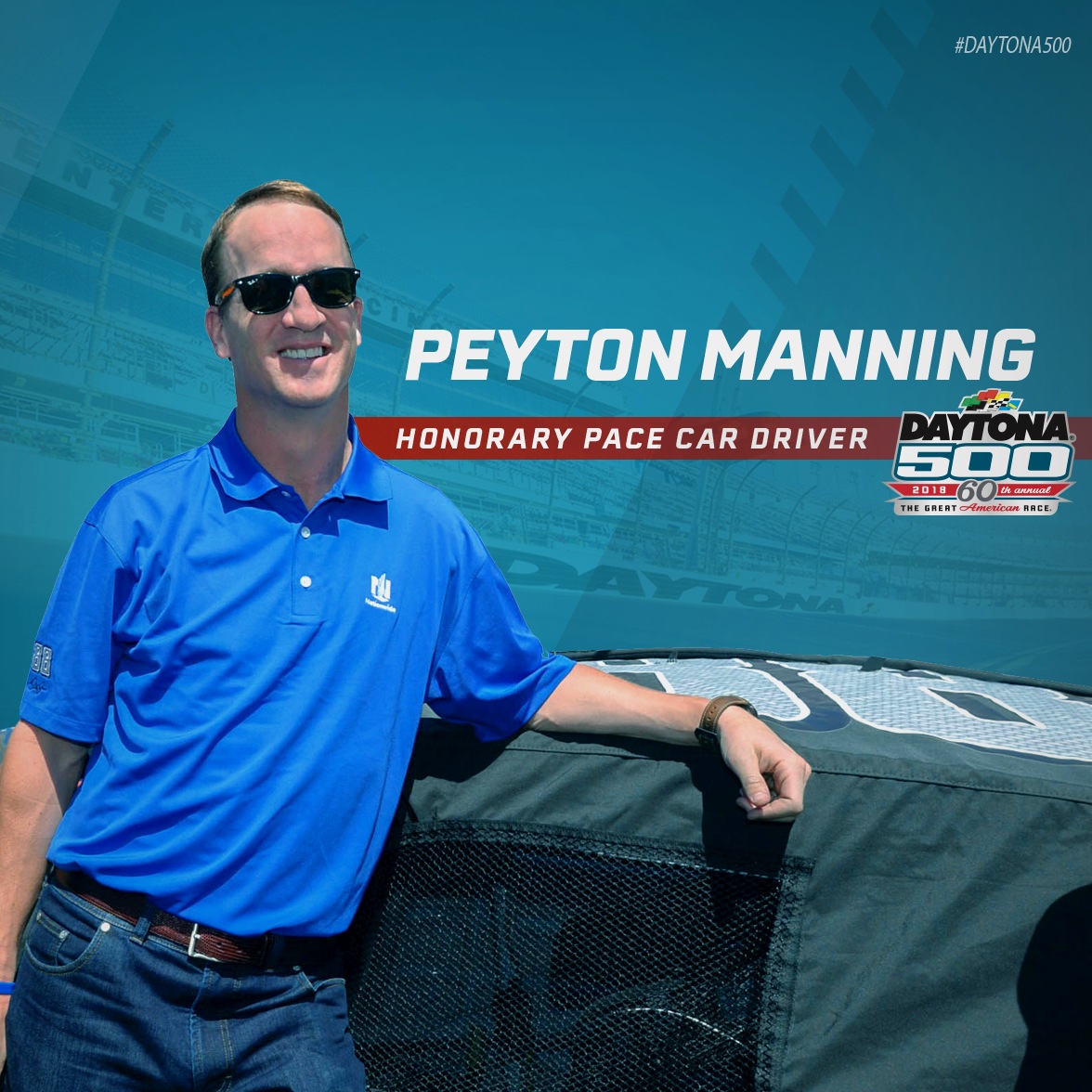
The 60th Daytona 500 brought marquee names into every honorary role — Grand Marshal, Honorary Starter, Honorary Pace Car Driver, Pre-Race Show performers. Each announcement was a high-visibility social moment requiring a graphic that was on-brand, sponsor-compliant, and ready to post before the news cycle moved on.
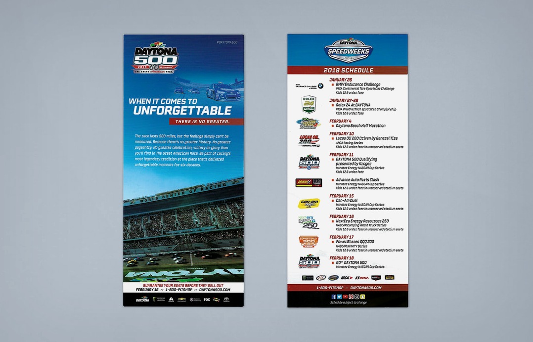
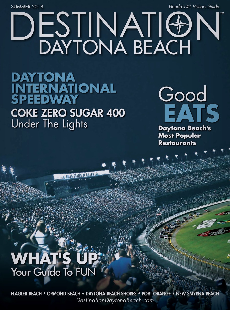
Speedweeks is the annual buildup to the Daytona 500 — a three-week, ten-event program covering everything from the Rolex 24 to the ARCA Racing Series to the Great American Race itself. Every event needed its own materials, all consistent with the parent brand, all sponsor-compliant, all ready on time.
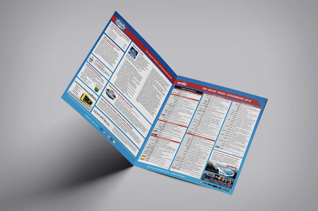
The Speedweeks rack card carried the full schedule on the back and a single, driving image on the front — the packed stands at night, "When it comes to unforgettable, there is no greater." The Inside Track camping brochure went deeper: a full open-spread event schedule and parking guide for fans making the trip. Clear, confident, built to live in hotel lobbies and visitors' centers across Daytona Beach.
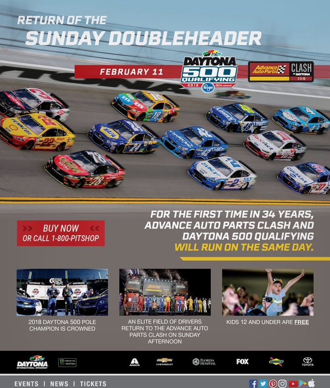
The Sunday Doubleheader campaign announced a historic moment: for the first time in 34 years, the Advance Auto Parts Clash and Daytona 500 Qualifying would run on the same day. The campaign needed to communicate the significance of that — fast, loud, and clearly — across both the event flyer and the email send.
Post-event thank-you emails kept the brand relationship alive after race day — a high-flying Supercross thank-you sent to attendees of the Monster Energy Supercross round at Daytona, complete with champion highlights and sponsor lockups.
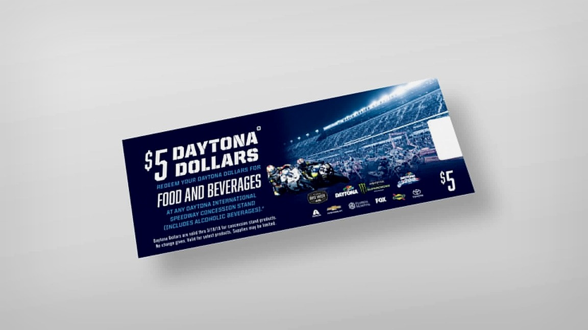
The scale of DIS print work demanded consistency under pressure. Sponsor lockups had to be exact — every logo in the correct tier, every size relationship correct, no exceptions. A concession voucher, a credential pass, and a pumpkin carving stencil all required the same level of brand precision.
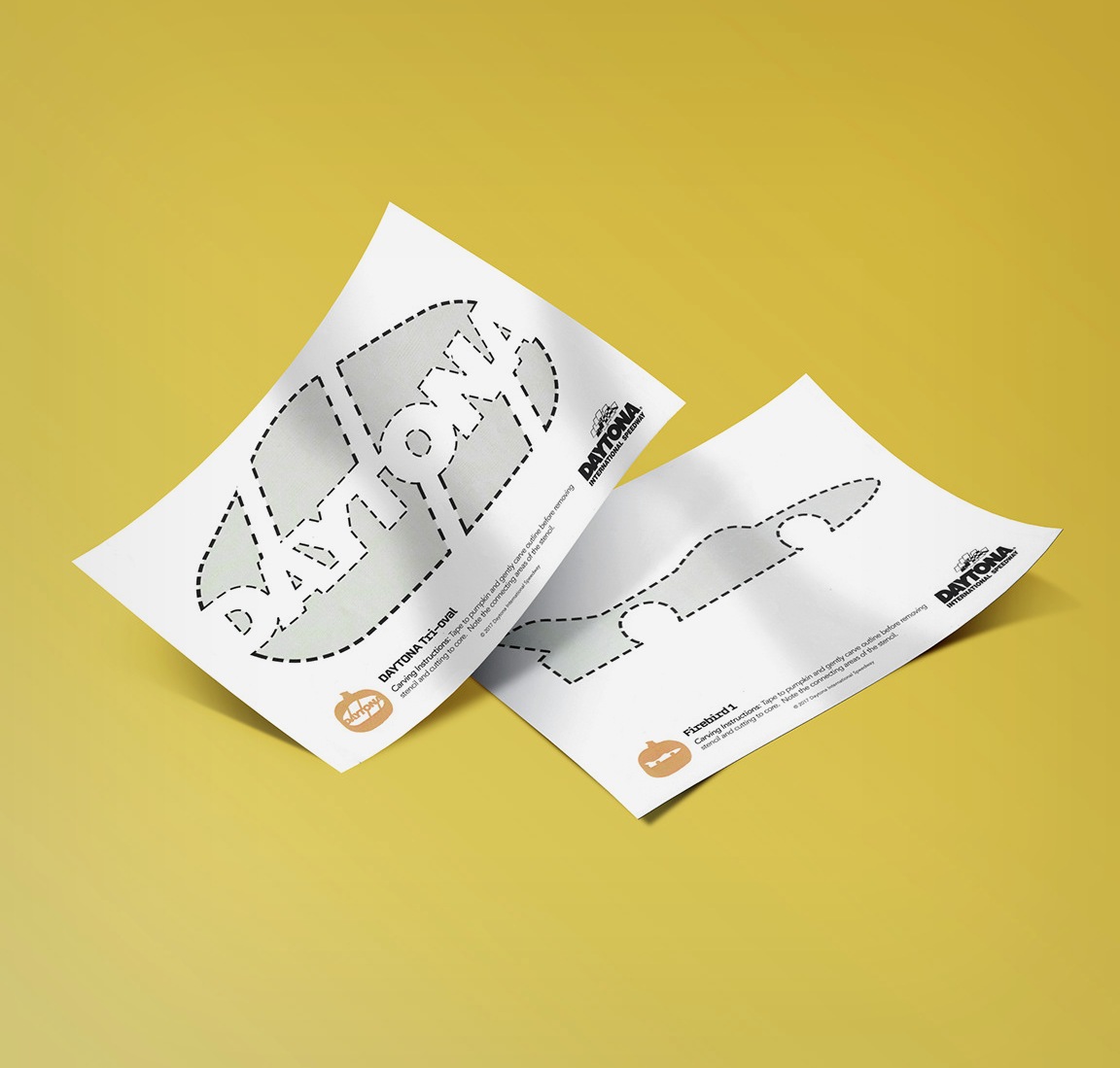
The seasonal stencils — a Tri-oval wordmark and the classic Firebird logo — were a fan engagement giveaway distributed digitally for Halloween. Small in scope, high in brand affection. The kind of piece that reminds fans why they love the track in the off-season.
Every piece, regardless of size or occasion, was produced under the same sponsorship compliance review — every logo tier verified, every partner represented at the correct prominence. At a facility with the sponsorship footprint of DIS, that isn't a minor concern.
This was high-volume, high-stakes production design at one of the most recognized venues in American sports — working with multiple internal teams, tight race-week windows, and a brand whose history demanded respect at every turn.