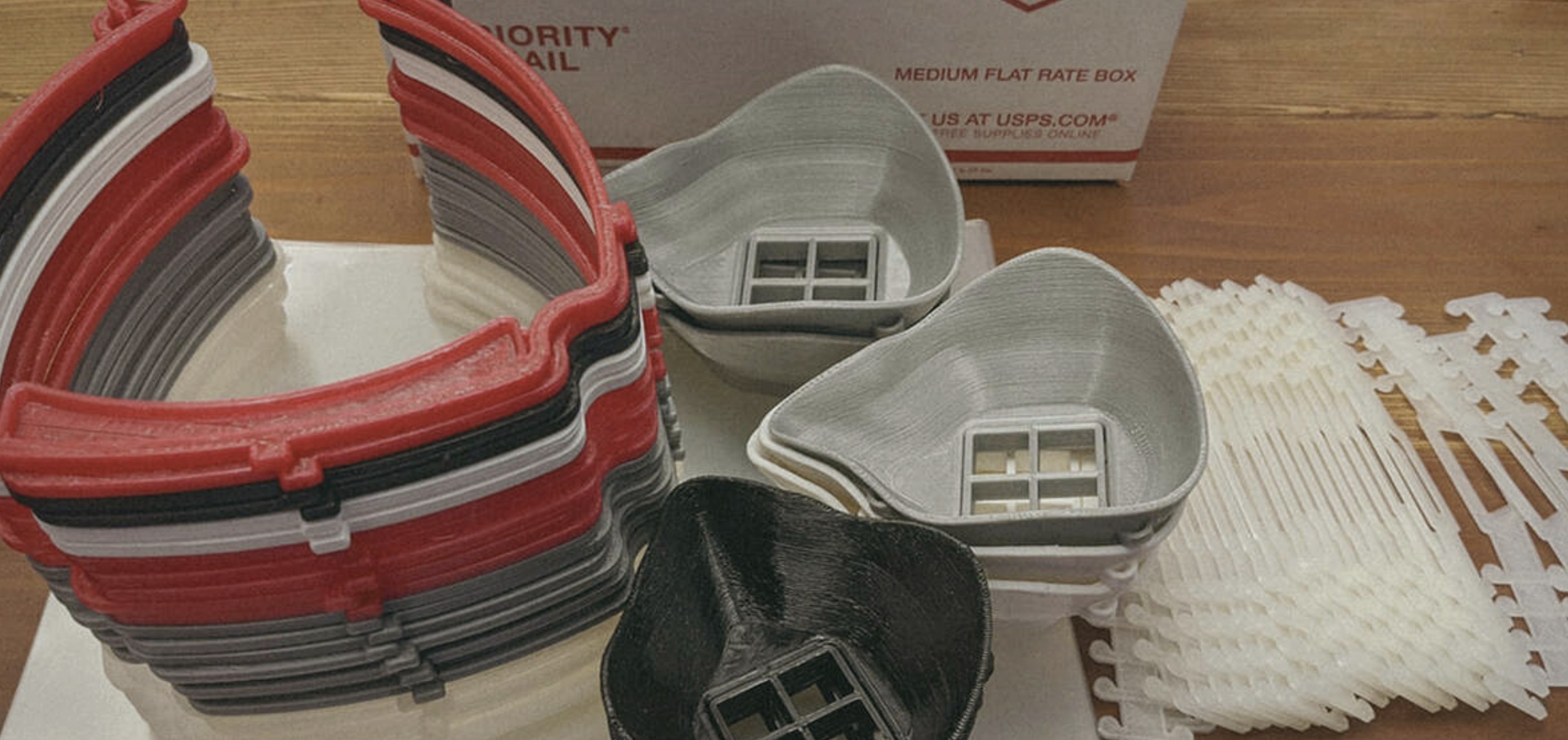
3Domensional was founded in the early months of the COVID-19 pandemic by an Air Force veteran in Rio Rancho, New Mexico. With local hospitals facing a critical shortage of personal protective equipment, she turned her 3D printers into a production line — manufacturing PPE and donating it directly to healthcare facilities in Albuquerque.
As the business grew beyond the pandemic response into a full-service 3D printing, additive manufacturing, and rapid prototyping operation, it needed a brand to match. The brief: build a crisp, approachable identity that balanced professionalism with timelessness — visually communicating the character and intention of the company.
The development process was thorough — 60 concepts across five rounds, working through dimensional letterforms, isometric printer icons, geometric mark systems, and typographic containers before arriving at the final direction. The name itself became the design opportunity: 3D as a bold dimensional mark, om as a typographic bridge, ENSIONAL anchoring it with industrial confidence.
The final logo was delivered to the client as a 640×360 animated GIF — sent over Facebook Messenger on April 13, 2020. The animation built the mark element by element: the dimensional printer icon assembling, the logotype sliding into place, the color filling in last. A logo reveal as a piece of craft in its own right.
The full deliverable package included 15 web-ready PNGs across four colorways, 12 print-ready files, 4 Facebook cover variations, 4 lossless vector EPS files, and a 5-second chroma key logo bump — everything the business needed to launch from day one.

The brand palette was defined with full precision — two Pantone-matched teals that work in tandem across print, screen, and physical production. Both colors were delivered with complete CMYK, RGB, LAB, and HSB values, ensuring accurate reproduction across every medium the company would use: 3D-printed stickers, branded packaging tape, Facebook covers, and everything in between.
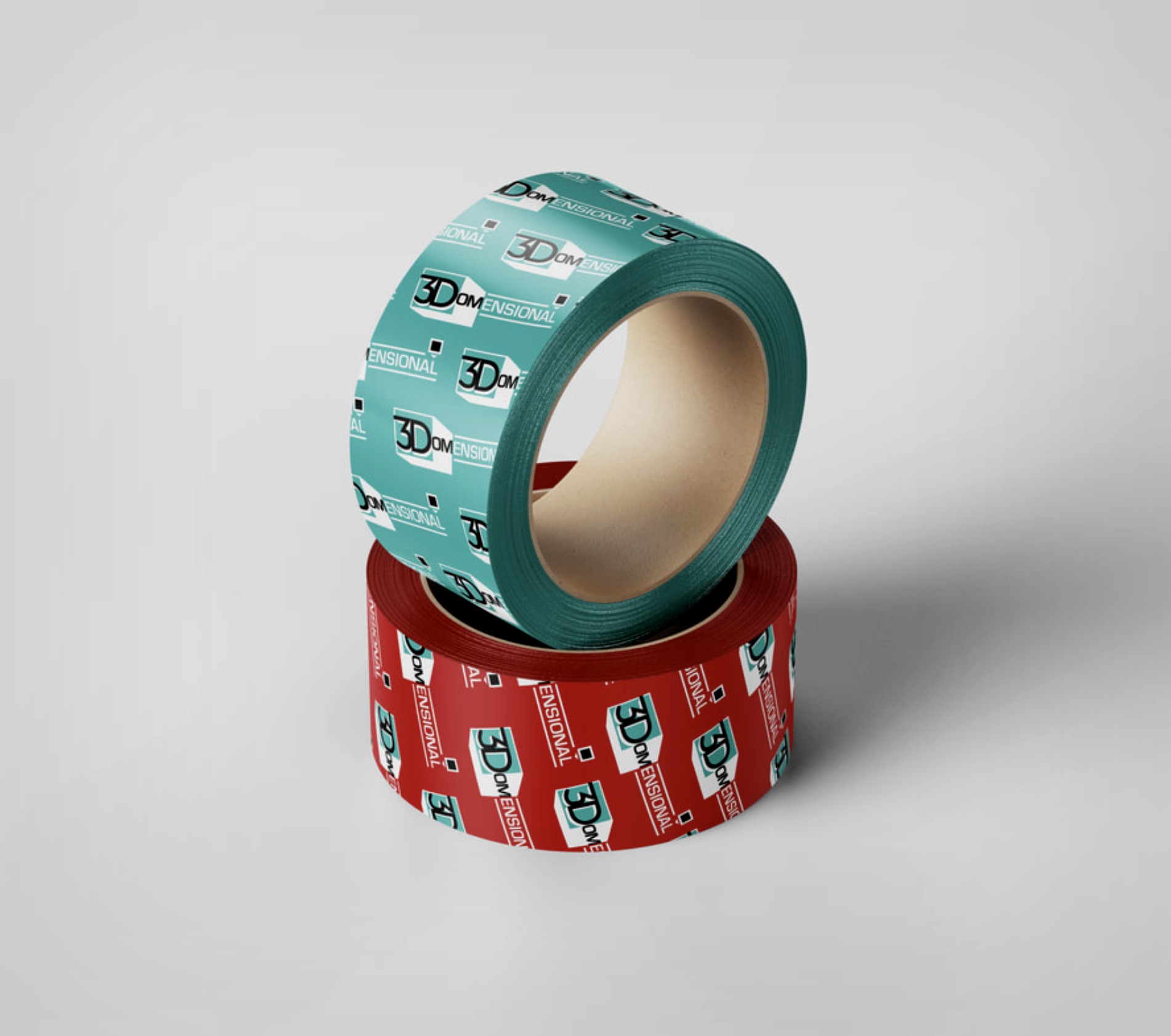
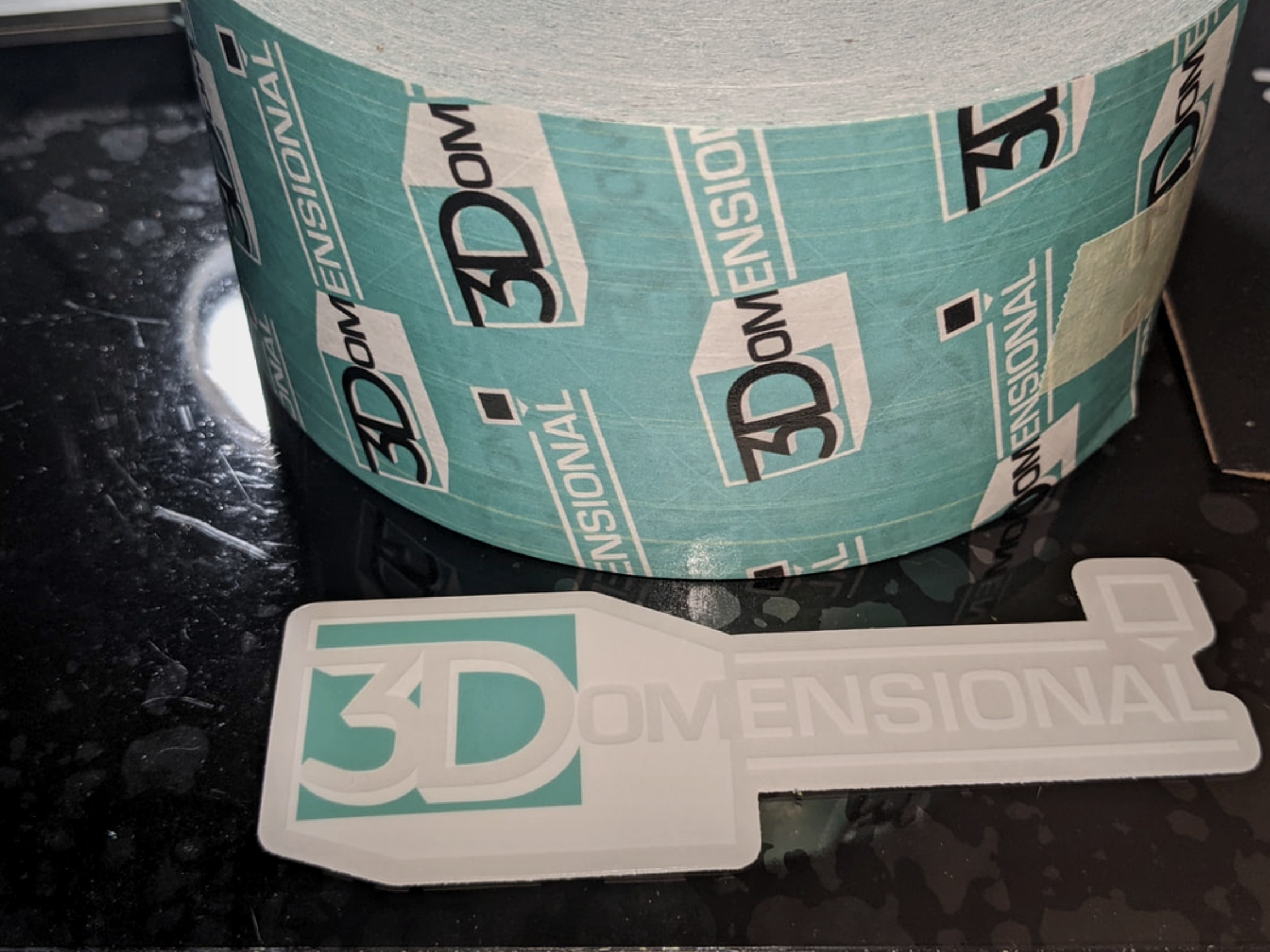
The brand went into production quickly. Custom packaging tape in both brand colorways — teal and red — kept every shipped order on-brand, from PPE donations to paid client fulfillment. The repeating logo pattern wrapped around rolls of tape and across shipping boxes, turning every outgoing package into a brand touchpoint.
A die-cut logo sticker, printed in-house on the company's own Prusa machines, put the brand identity to work as a product in itself — a calling card that demonstrated the company's capability and reinforced the brand at every customer interaction.
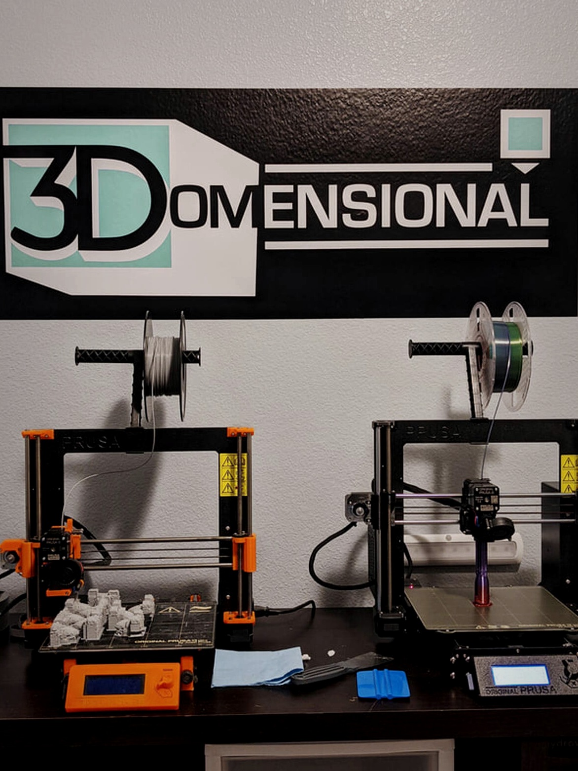
The wall decal in the studio — large-format, bold, anchoring the workspace — made the brand visible and real from day one. A startup that looked like it had been around for years.

Responsible for transforming the company's branding concepts into reality and developing the full suite of supplementary assets to support the launch of the business — from the first sketch to printed tape on a shipping box.