Sewing History Museum Project
Back to Work
Brand Identity · Rebrand 2024

The Sewing
History Museum

Client Sewing History Museum, Inc.
Location Wichita, Kansas
Scope Logo · Identity · Messaging · Print · Strategy
Challenge
Re-engage a community.
Deliverables
5 project objectives
Brand Driver
"Wonder"
Tagline
Weaving Wonder into Every Stitch.

A museum with a story to retell.

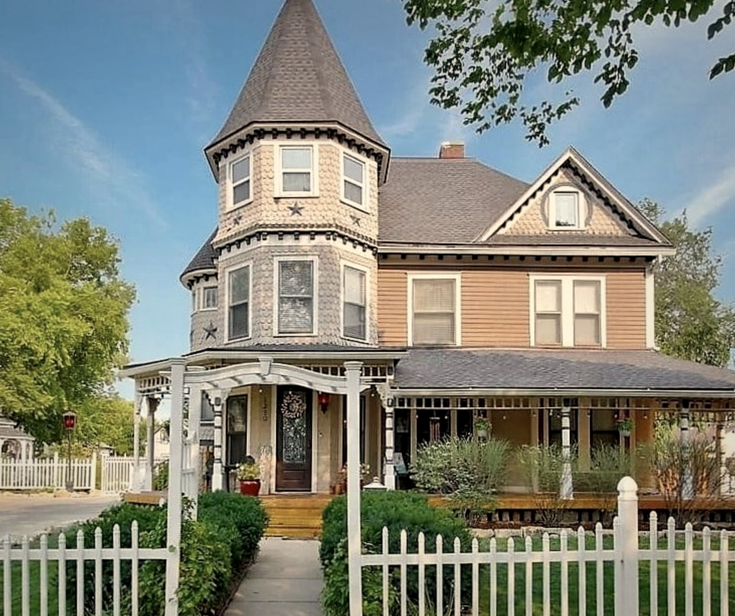
The Sewing History Museum is a one-of-a-kind institution nestled in a beautiful Victorian house in midtown Wichita. Three years after opening, organic foot traffic had waned — and the brand wasn't pulling its weight. The goal: a full visual and messaging overhaul that honors the museum's history while building national awareness.

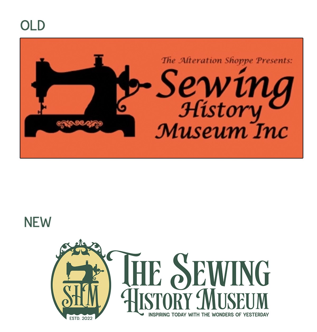
That meant shedding the rustic orange (a little too close to that famous sewing machine brand from the 1800s), finding a voice that's both knowledgeable and genuinely warm, and building out every touchpoint from logo to merch to social strategy.

Brand Identity Revitalization — a stronger logo mark to enhance competitive position nationally
Brand Messaging — tone, voice, tagline, slogan, and a brand story worth sharing
Brand Positioning — competitor analysis, value proposition, and audience definition
Marketing Strategy — improved online + offline accessibility and social media direction
Experimental Marketing — unconventional outreach to expand reach inclusively
Project Objectives
Project scope and objectives overview

Same craft. New identity.

The old mark — orange, rustic, heavy — was practically waving a Singer flag. The new identity needed to feel Victorian without feeling dated, distinctly Kansan without feeling regional, and warm without feeling generic. Every element of the redesign was a deliberate departure.

Old and New Logo Comparison
The thinking
Logo mark — emblem and text integrated; rustic orange removed to differentiate from Singer's legacy colors
Type — period-specific Victorian typefaces, customized to complement the emblem and the building that houses the museum
Color — deep forest green + Kansas gold, drawing from the state's heritage, the Sunflower State, and the Victorian era's elegance
Verbiage — "Inc." replaced with "Estd. 2022"; slogan integrated as a natural extension of the mission
"Does it feel a little bit like Oz? That's OK — it's Kansas, and it's classy."
Forest Green
PANTONE 568 C
#2D5A4A
Kansas Gold
PANTONE 1235 C
#E8D97A
White
Supporting
#FFFFFF

The brand in the real world.

From business cards to merch to the sign in front of the Victorian house itself — every touchpoint was developed to feel cohesive, polished, and period-appropriate. The green and gold system holds beautifully across both apparel and print.

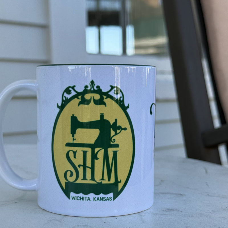
Business cards carry the clean white front / forest green back split. The ceramic mug puts the full emblem center stage. The long sleeve — a forest green billboard with the wordmark across the back — turned out sharp.

Brand Collateral — shirts, mug, business cards, color swatches
Apparel, print collateral, color system, and environmental signage
Sewing History Museum Project Highlights

The word is wonder.

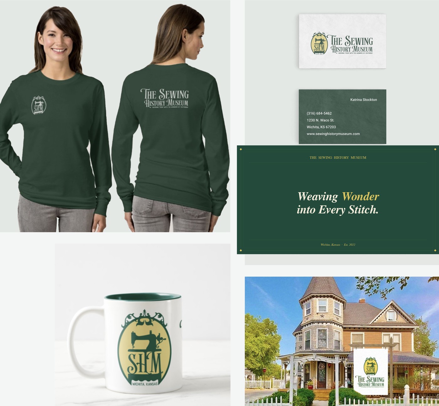
The brand driver — a single word that anchors every communication decision. Not nostalgia, not history, not craft. Wonder. It's the feeling you get when you see a 150-year-old machine still running. It's what the museum promises.

Tone
Warm, inviting, and inspirational. A sense of nostalgia and creativity that honors the history of sewing while fostering vibrant community engagement.
Voice
Combines warmth, creativity, and a touch of whimsy. Speaks to enthusiasts and newcomers alike — knowledgeable and approachable in equal measure.
Slogan
"Inspiring Today with the Wonders of Yesterday"
Tagline
"Weaving Wonder into Every Stitch."